
Who This Image Strategy Is For (And Why It Matters Now)
Typical UK WordPress and WooCommerce problems with images
Most UK WordPress and WooCommerce sites are slowed down more by images than by anything else. Common patterns include:
- Homepage hero banners uploaded at 6000+ pixels wide from photographers or designers.
- WooCommerce product photos straight from suppliers, often 5–15 MB each.
- Blog posts with screenshots saved as uncompressed PNGs.
- Multiple sliders and galleries all loading full‑size images on mobile.
- Years of unused thumbnails from old themes and plugins filling the uploads folder.
The outcome is familiar: slow first loads on 4G, poor scores in PageSpeed Insights, and checkout pages that feel sluggish just when customers are ready to pay. If you run an image‑heavy site, this guide is written for you.
If you want a wider picture of how images fit into overall speed, the article Practical WordPress Speed Optimisation for Non‑Developers is a useful companion.
How images quietly wreck Core Web Vitals and mobile experience
Images affect nearly every Core Web Vitals metric:
- LCP (Largest Contentful Paint): hero images and large banners are often the LCP element, especially on home and landing pages.
- CLS (Cumulative Layout Shift): if your images do not have fixed dimensions, content jumps when they load.
- FID/INP (interaction delay): heavy pages keep the browser busy decoding images, which slows interaction.
On UK mobile networks, even with decent 4G, a few uncompressed 2–3 MB images can add several seconds to the first meaningful paint. On rural connections or in busy city centres, this can be enough for users to give up.
For a deeper explanation of realistic UK‑focused Core Web Vitals targets, you can refer to Realistic Core Web Vitals for WordPress.
What you will have by the end: a clear, repeatable image workflow
By the end of this article you will have:
- A small set of core image sizes that match how you actually use images.
- Sensible WordPress and WooCommerce media settings.
- A clear approach for compression and modern formats like WebP and AVIF.
- A simple workflow your team can follow without needing to “tune” each image.
This is not about chasing perfect scores. It is about a practical image strategy that keeps your UK site fast and manageable over time.
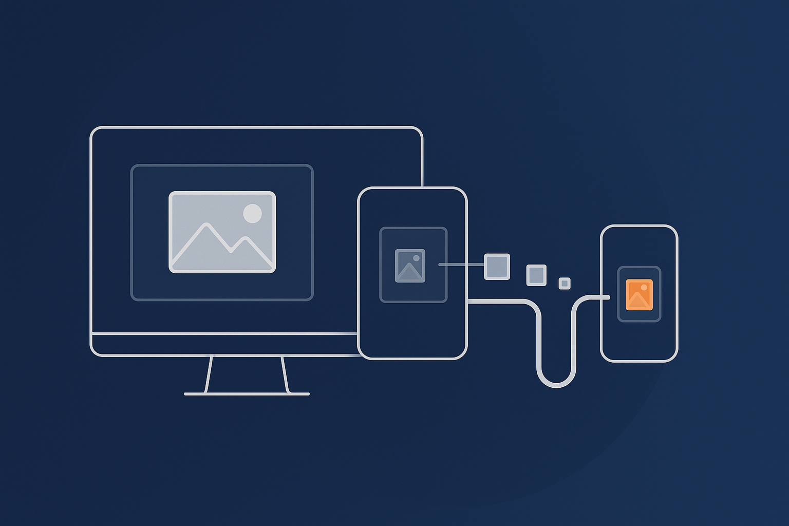
The Fundamentals: How WordPress Handles Images Behind the Scenes
What happens when you upload an image in WordPress
When you upload a single image to WordPress, it does not just store that file. WordPress:
- Saves the original file in
wp-content/uploads/yyyy/mm/. - Creates several resized copies (thumbnails) based on your Media settings and any theme/plugin image sizes.
- Stores metadata so it knows which sizes exist and how large they are.
Your pages then reference these generated sizes, not the original file in most cases. If the underlying sizes are not well chosen, your site either serves oversized images or generates far more variants than you need.
Default image sizes and thumbnails explained (thumbnail, medium, large, full)
By default, WordPress creates:
- Thumbnail: 150 × 150 pixels, cropped to a square.
- Medium: up to 300 × 300 pixels, proportional.
- Large: up to 1024 × 1024 pixels, proportional.
- Full: the original file, unmodified.
These are used by the block editor, galleries and various theme components. If you never adjust these numbers, they often do not match your real design, especially for modern wide layouts and large monitors.
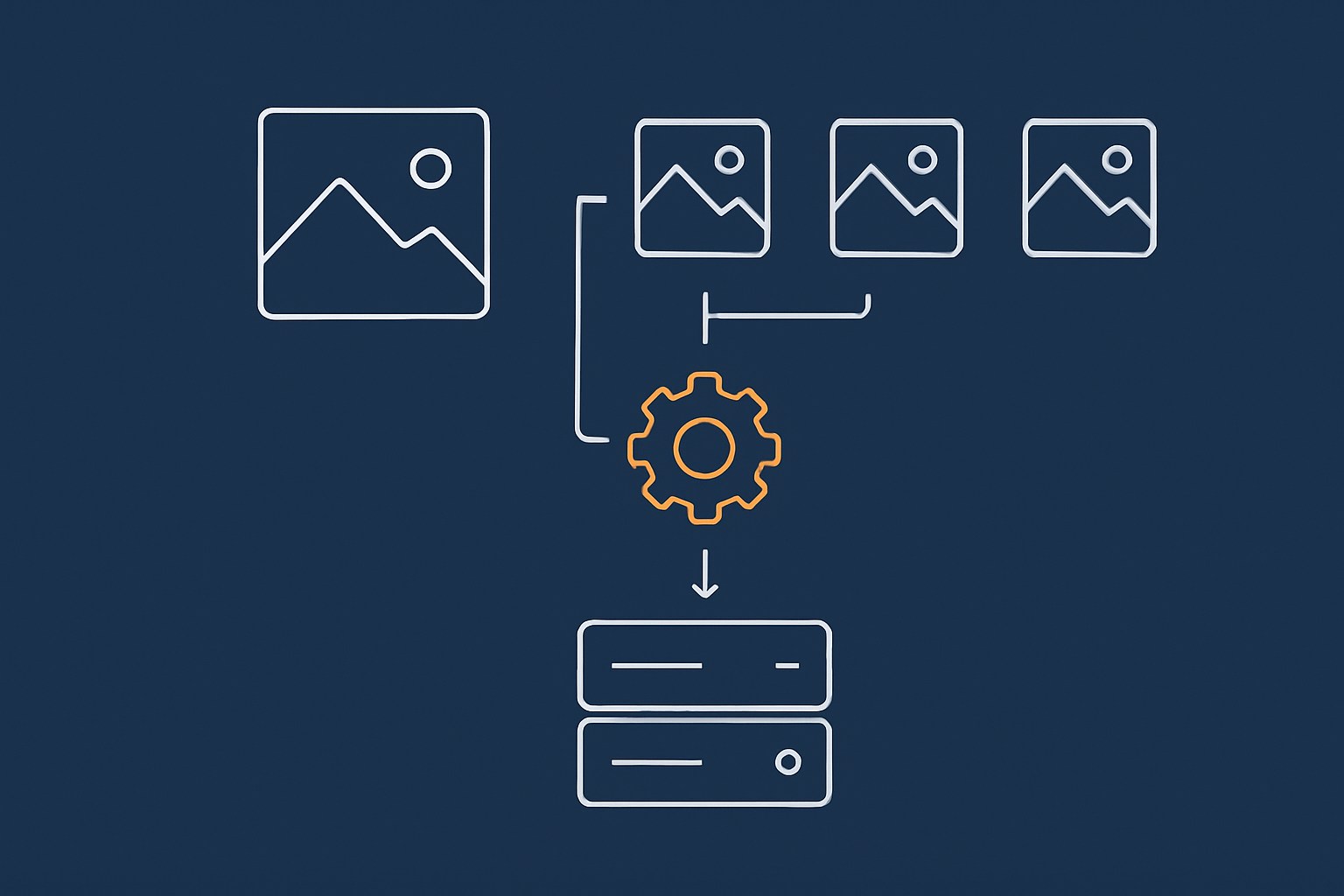
Theme and plugin generated sizes: why your uploads folder keeps growing
Themes and plugins can register their own image sizes. Common examples:
- Page builder “hero”, “banner” and “background” sizes.
- Blog listing thumbnails and featured image sizes.
- WooCommerce product, catalogue and gallery sizes.
Each new size can create one more file for every image you upload. Over years, this leads to tens of thousands of files, many of which are never used. A sensible strategy starts with deciding which sizes you actually need, then trimming the rest.
Deciding Your Core Image Sizes (Before You Touch Any Plugins)
Audit where and how you use images
Start with content, not with settings. Take your main templates and write down where images appear:
- Homepage hero and key landing page banners.
- Blog featured images and in‑content images.
- WooCommerce product listings, single product galleries and category pages.
- Logos, icons, testimonials, team photos.
For each area, check how wide the image appears on a typical laptop screen. You can right‑click in Chrome, choose “Inspect” and use the element highlighter to see the CSS width in pixels.
Sensible pixel widths for common layouts
For most UK business and WooCommerce sites, these are reasonable starting points:
- Full‑width hero banners: 1800–2000 px wide.
- Standard content images (in blog posts, pages): 1200–1400 px wide.
- Sidebar thumbnails: 300–400 px wide.
- WooCommerce product grid images: 400–600 px wide.
- Single product main image: 800–1200 px wide, depending on design.
These figures assume a mix of desktop, tablet and mobile, with some headroom for high‑density screens. There is rarely any point serving 4000 px wide images for standard content areas.
Configuring Settings → Media for realistic defaults
Once you know the rough sizes you need, set your WordPress defaults under Settings → Media. For example:
- Thumbnail size: 300 × 300 (useful for grid layouts and some widgets).
- Medium size: 768 × 0 (height blank so it scales proportionally).
- Large size: 1400 × 0 (for full‑width content images on typical blogs).
This aligns the built‑in sizes with real layout widths, which makes WordPress’s responsive image system far more effective.
When to customise or remove extra image sizes added by themes and plugins
Many themes register multiple “large” variants such as hero-1920, hero-2560, banner-1440 and more. Not all of them are actually used.
Topics to discuss with your developer or agency:
- Check which custom sizes are referenced in templates. Remove sizes that are never used.
- Consolidate overlapping sizes into a smaller set that covers your real layouts.
- Disable creation of sizes you no longer need to stop unnecessary files being generated.
This usually requires a small code snippet in your theme or a site‑specific plugin. The payoff is less disk usage and a cleaner set of options for responsive images.
Thumbnails and WooCommerce Product Images: Keeping Quality Without Bloat
How WooCommerce product image sizes work
WooCommerce uses three main image types:
- Main image: the large image on the product page.
- Catalogue image: used in product grids and category listings.
- Thumbnail: used in galleries, related products and widgets.
You can configure these under Appearance → Customise → WooCommerce → Product Images in most themes. Some themes override these settings, so you may also see options in the theme panel.
For many shops a good baseline is:
- Main image: 1000–1200 px width.
- Catalogue: 600–800 px width.
- Thumbnail: 300–400 px width.
If you run a visual catalogue, such as fashion or furniture, lean towards the higher end. For parts, accessories or B2B catalogues, the lower end is usually fine.
Choosing product image dimensions that balance quality and speed
The goal is to avoid “soft” images on large monitors without wasting data on mobiles. A practical approach:
- Design for a 1440 px wide laptop as your reference screen.
- Ensure the main image width never exceeds about 70–80% of that in your layout.
- Set WooCommerce image widths so the generated files slightly exceed that layout width (to allow for zoom and retina screens), but not by thousands of pixels.
For image‑heavy catalogues, choosing fast WooCommerce hosting with image-heavy catalogues that includes proper caching and media handling will also help keep product pages responsive under load.
Avoiding over‑large source images from photographers, suppliers and designers
The best time to optimise is before upload. Guidelines you can give to suppliers:
- Maximum dimension: 2500 px on the longest side.
- Preferred format: JPEG for product photos and lifestyle shots.
- File size target: under 500 KB for most product images, under 1 MB for complex scenes.
If you receive 8000 px, 20 MB images, batch‑resize them locally before uploading. More on tools for this later.
Regenerating thumbnails safely after size changes
When you change WooCommerce or Media sizes, existing images keep their old dimensions. Use a regeneration plugin such as “Regenerate Thumbnails” to generate the new sizes.
Safer practice:
- Take a backup before regenerating.
- Regenerate on a staging copy if possible, then swap over.
- Limit regeneration to recent uploads if your library is very large.
This avoids large CPU spikes on shared hosting and reduces the chance of timeouts.
Compression That Actually Makes Sense: JPEG, PNG, WebP and AVIF
Which format to use for what
A simple rule of thumb:
- JPEG: Photos, product images, anything with gradients and many colours.
- PNG: Logos, icons, simple graphics, and images that genuinely need transparency.
- SVG: Simple logos and icons where supported by your theme and security setup.
- WebP / AVIF: Modern replacements that shrink both photos and graphics significantly.
In practice, start from JPEG or PNG depending on the content, then let your optimisation layer handle WebP and AVIF conversion.
Choosing a compression level: lossless vs lossy in plain English
Lossless compression keeps every pixel, so quality is perfect but file size reductions are modest. Lossy deliberately discards some visual information in ways that are not obvious to the eye, which can cut file size far more.
Practical guidance:
- For photos, a quality setting around 70–80 (on a 0–100 scale) is usually more than enough.
- For logos and UI elements, keep them sharp but small. Convert noisy PNGs to SVG or high‑quality WebP where possible.
Using plugins vs server‑side optimisation for WordPress images
You have two main routes for compression and modern formats:
- Plugins (e.g. image optimisation plugins that talk to an external API). These compress images at upload or bulk‑optimise the library. They add another plugin to maintain and can consume resources during bulk runs.
- Server‑side or CDN‑level optimisation. Images are converted and optimised as they are delivered, with the server choosing the best format for each browser.
Server‑side optimisation usually produces consistent results with less work inside WordPress and avoids heavy bulk tasks that can slow down your admin area.
How modern formats like WebP and AVIF cut page weight by 60%+
WebP and AVIF can often reduce file sizes by 50–70 percent compared with equivalent JPEGs at similar visual quality. On a typical UK homepage with 1–2 MB of hero and banner imagery, moving to AVIF or WebP can easily save over 1 MB per view, which has a direct impact on both LCP and bandwidth costs.
How the G7 Acceleration Network handles AVIF/WebP automatically on the fly
The G7 Acceleration Network image optimisation and caching automatically converts suitable images to modern AVIF and WebP formats on the fly, usually cutting file sizes by more than 60 percent while keeping real‑world quality. It is included for every site hosted with G7Cloud, without extra plugins or WordPress configuration.
Responsive Images, Lazy Loading and Layout Shift
What srcset and sizes actually do
Responsive images rely on two attributes:
srcset: a list of URLs and widths, for example:image-400.jpg 400w, image-800.jpg 800w, image-1200.jpg 1200w.sizes: instructions for how wide the image will appear at different viewport widths.
The browser reads both and chooses the most appropriate file to download. If you only have a huge “full” image, or if your theme provides poor sizes values, mobile devices often end up downloading far more than they need.
WordPress built‑in responsive images and native lazy loading
Since WordPress 4.4, the platform generates srcset and sizes attributes automatically for images inserted through the editor, as long as several sizes exist for that image. From WordPress 5.5 onwards, images also get loading="lazy" by default, which defers off‑screen images until they are needed.
The main caveats:
- Some themes and page builders override or disable these attributes.
- Background images added via CSS or page builders are not covered by default responsive logic.
Check your key templates in the browser inspector and confirm that large images have srcset and sizes. If not, it may be worth reviewing theme options or considering a lightweight block‑based approach.
Avoiding CLS from banners, sliders and hero images
Layout shift often comes from banners and sliders that do not reserve space for images. To avoid this:
- Ensure images have explicit width and height attributes, or use CSS to set fixed aspect‑ratio boxes.
- Avoid inserting sliders that change height between slides.
- Check the CLS section in PageSpeed Insights for mobile, focusing on image components.
Most modern block themes handle this better, but custom CSS or complex layouts can still introduce jumps if not tested carefully.
Common page builder pitfalls (Elementor, Divi, Gutenberg patterns)
Page builders can add overhead to image handling:
- Using full‑size images for background sections, regardless of viewport size.
- Sliders and carousels that load all images at once instead of lazily.
- Inline styling that prevents WordPress from generating good
sizesattributes.
If you rely on a builder, review how it handles image sizes, lazy loading and background images. The guide WordPress Page Builders and Hosting: How Elementor, Divi and Gutenberg Really Affect Speed goes into more detail on common pitfalls.
A Simple, Repeatable Image Workflow for Your Team
Step 1: Start with sensible source files
Agree simple rules with designers, photographers and marketing staff:
- Maximum dimensions (for example, 2500 px longest edge).
- Preferred formats (JPEG for photos, PNG/SVG for logos and UI).
- Target file sizes by type (for example, hero images under 400–600 KB, standard images under 250 KB).
Step 2: Resize before upload where possible
You do not need Photoshop. Practical tools include:
- Windows: built‑in Photos app or free tools like IrfanView for batch resizing.
- macOS: Preview for quick resize and export.
- Browser‑based: tools that allow setting pixel width and JPEG quality before download.
Resize to roughly your largest needed display width before upload. WordPress will then generate smaller sizes as required.
Step 3: Upload, check generated sizes and test a key page
After adjusting your Media and WooCommerce settings, upload a few representative images and check:
- That thumbnails and large sizes look crisp but not oversized.
- That product and blog layouts are using the expected sizes (inspect element to confirm).
Then run a key page through PageSpeed Insights and check the “Serve images in next‑gen formats” and “Properly size images” audits. Fix the biggest offenders first.
Step 4: Housekeeping: deleting unused images and keeping the library tidy
Over time the media library fills with unused images and legacy thumbnails. To keep control:
- Periodically remove unused media (carefully, with backups).
- When changing themes, review which image sizes are still required.
- Document your chosen sizes and formats so new content follows the same rules.
How often to review image performance and what to look for
A light review every few months is usually enough:
- Test key templates (home, top category, product, important landing pages) in PageSpeed Insights.
- Check that no single image is excessively large on mobile.
- Watch for new sliders, banners or background images that break your rules.
If you are working with managed WordPress hosting for UK business sites, your host should be able to help interpret performance reports and spot obvious media problems.
Hosting, Caching and Bot Protection: The Other Half of Fast Images
Why image strategy still needs good hosting and caching behind it
Even perfectly sized and compressed images can feel slow on underpowered hosting or without caching. Every uncached page view forces the server to generate the HTML again, then fetch and serve images from disk.
Hosting tuned for WordPress, with solid object and page caching, reduces the time to first byte so that your optimised images can start loading as quickly as possible. G7Cloud’s WordPress performance features at the hosting level are an example of this focus.
How CDN‑style edge caching keeps images fast across the UK
Without a CDN, every visitor hits your origin server, which may be in a single data centre. With edge caching, copies of your static assets, including images, are stored on servers closer to your visitors around the UK and beyond.
This shave of tens of milliseconds off each request does not sound like much, but across many images it adds up, especially for image‑heavy WooCommerce category pages and galleries viewed from different parts of the country.
Bad bots, crawl load and how they waste bandwidth on images
Search engines and genuine crawlers are expected, but many sites are hit by bad bots that scrape images, brute‑force login pages or repeatedly hammer product URLs. All of this uses bandwidth and CPU, often just to repeatedly serve large images.
G7Cloud’s bot protection within the G7 Acceleration Network filters abusive and non‑human traffic before it reaches PHP or the database, reducing wasted server load and helping keep response times stable during genuine busy periods.
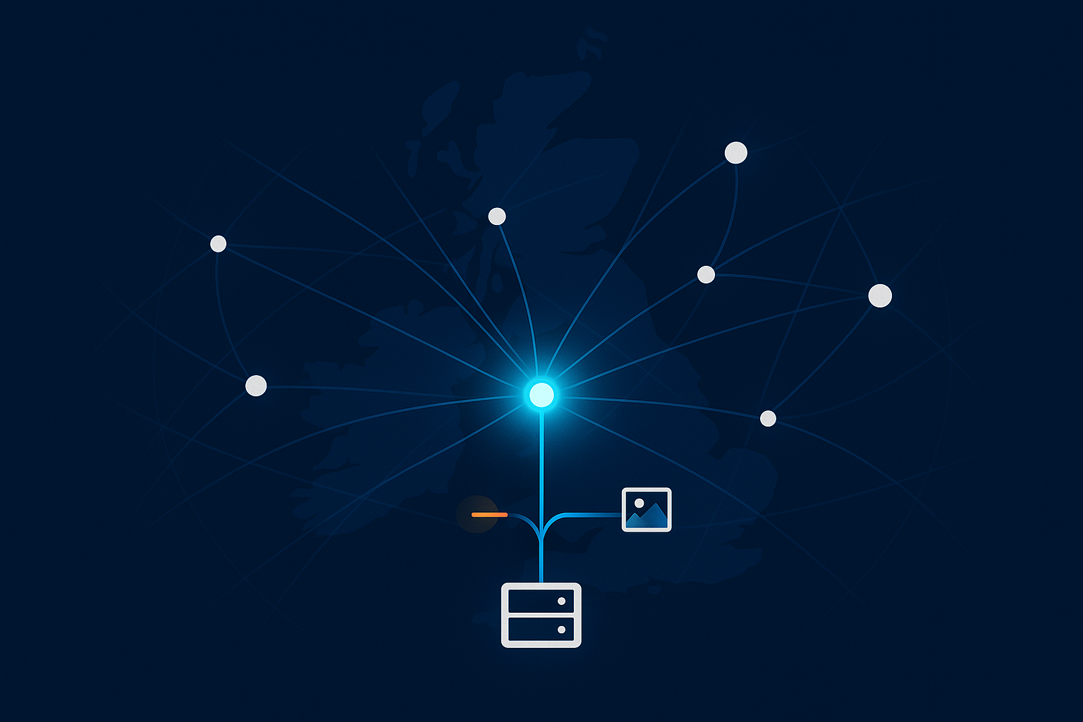
Where the G7 Acceleration Network fits: caching, image optimisation and bot filtering
The same G7 Acceleration Network layer that handles AVIF/WebP conversion also provides edge caching for images and pages, as well as bot filtering. For site owners this means:
- No need to stack multiple separate plugins for caching, image optimisation and basic WAF rules.
- Consistent behaviour across environments without constant plugin tuning.
- Fewer moving parts to maintain when themes or WooCommerce are updated.
If your team prefers to focus on content and trading rather than infrastructure, this sort of hosting‑level solution can remove a lot of friction.
Putting It All Together: A Quick Checklist You Can Use Today
One‑page checklist for WordPress image sizes, thumbnails and compression
Use this as a quick review of your current setup:
- List where images appear (hero, content, product grid, product page, galleries).
- Measure the displayed width of each type on a laptop screen.
- Set Media sizes to sane defaults (for example, thumbnail 300, medium 768, large 1400).
- Review WooCommerce product image widths and adjust to match your layout.
- Agree source file rules with your team (max dimensions, formats, size targets).
- Resize images before upload when practical.
- Confirm
srcset,sizesandloading="lazy"appear on key images. - Check for and remove unused theme/plugin image sizes.
- Run core templates through PageSpeed Insights and fix oversized images.
- Review results every few months or after major design changes.
When to call in help from your host or developer
Bring in extra help when:
- Theme or builder code makes it difficult to control image sizes or responsive behaviour.
- You need to safely remove or rename image sizes across a large library.
- You are dealing with heavy WooCommerce traffic and want to balance speed, caching and stock accuracy.
If this all feels like more than you want to manage in‑house, exploring managed WordPress hosting for UK business sites that includes the G7 Acceleration Network can be a straightforward way to combine sensible image handling, edge caching and bot filtering without adding more plugins to your stack.